With the wide uptake of the Discourse Sidebar, I wonder if it is time to revisit the layout of Wizards.
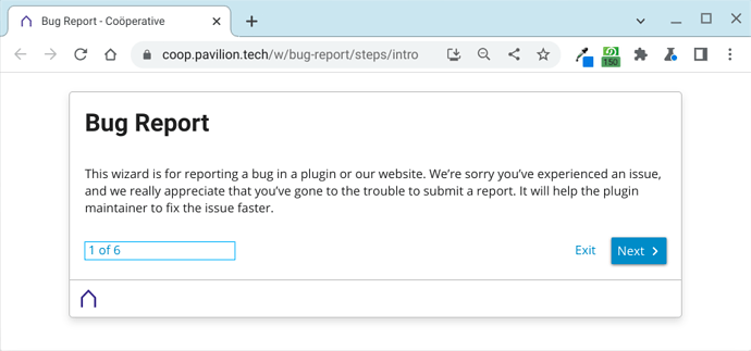
Currently, a Wizard will remove the header and display over the whole page. With the sidebar disabled, that works quite well:
No sidebar
With the Sidebar
However, when the sidebar is active, it isn’t so nice. Note that as the header is missing, it is no longer possible for the user to hide the sidebar (‘hamburger’ is not there). Also the sidebar moves up, which creates an unpleasant jarring effect (click /w/bug-report to see what I mean):
This gives us
- Poor presentation
- Distraction from the wizard
- Incomplete ability to navigate
The last 2 are always in tension, and we really need to choose focus vs. navigation. At the moment with the Sidebar we’ve got the worst of both worlds.
Suggestions
I think that we should address this in some way as it isn’t great on sites with the sidebar active.
Option 1
Hide the sidebar when a Wizard is displayed
Would keep things nice and clean, and the user focussed completely on the Wizard
It restricts the user from navigating the site, which in some situations is helpful but in others is unhelpful.
Option 2
Display the header and the sidebar when a Wizard is displayed
Would solve the primary UX problem, and allow users to navigate if needed (or Log in / Sign Up)
However, It makes for a busier Wizard page with the potential for the user to be sidetracked.
This would help us on coop.pavilion.tech by allowing users to login directly from the Bug Report Wizard if needed

