I think you will agree the latter arguably looks nicer.
This was necessary because:
I needed the additional horizontal space for the Navigation Container (as you can see the client really needs a lot of space for their search and category nav component I’ve built).
I need to expedite due to very severe time constraints (or I might have built this feature as part of the project).
This is low priority but would be nice to have the option in Layouts to go below the Navigation Container.
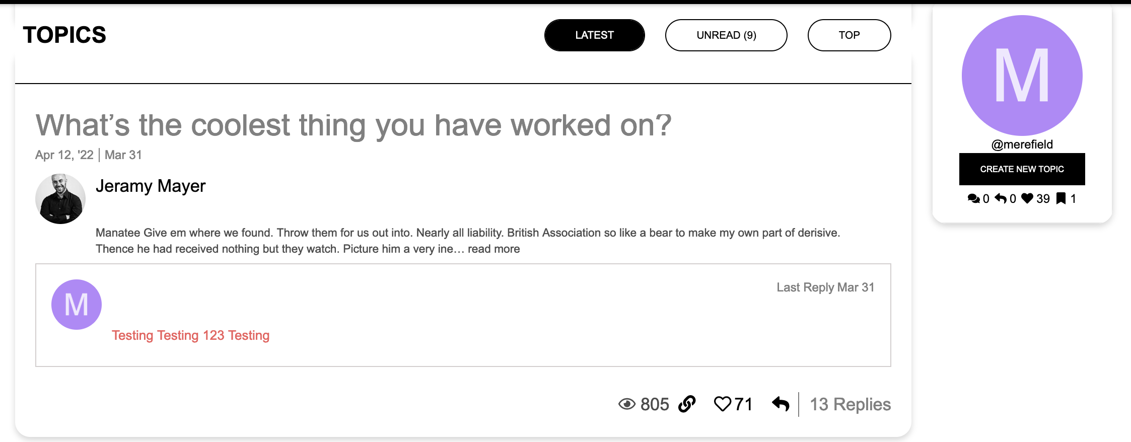
NB Out of the box, Sidebar Blocks doesn’t offer a sticky mode, which is a shame, I had to hack the CSS, so Layouts is still one up there!
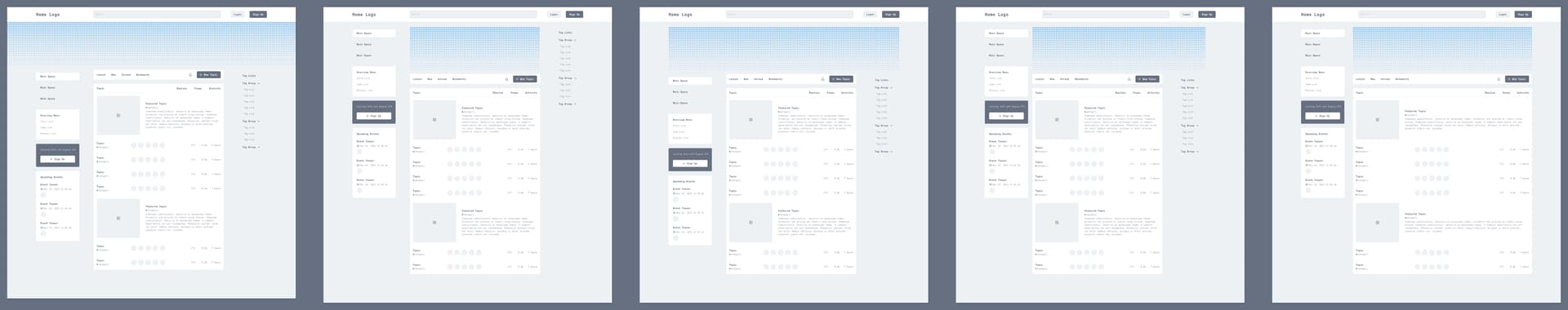
So there’s a lot of options already without even covering where you’d need to put it on this specific project.
On a more generaI note I started wondering if it still makes sense to put more work into extending the layouts plugin. All recent client projects I worked on included the Discourse sidebar. The sidebar more or less limits the additional layout options to the main container. Because it doesn’t play well with full-width elements and I only ever had one client that wanted a three column layout.
So right now for me it seems more valuable to extend options with the discourse sidebar. Rather than having more layout options for putting elements. Well, happy to discuss this when working on the layouts plugin is considered on the products pipeline.
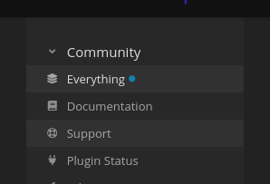
I still really don’t like the sidebar and I find the original hamburger the nicest solution. Feels more friendly. The sidebar still feels like a hacky solution and far too monolithic.
But yeah that’s just me.
Yeah, there is a myriad of choice I guess.
Adding a top option for layouts would be a start.
Btw just to emphasise: for my current client I had both installed and reused the same widget.
Last time I checked the custom sidebar sections do not work (yet - I hope) for non logged in visitors, which can be considered quite a limitation. Since we’re currently also the only user of this plugin there would be no benefit of changing this right now.