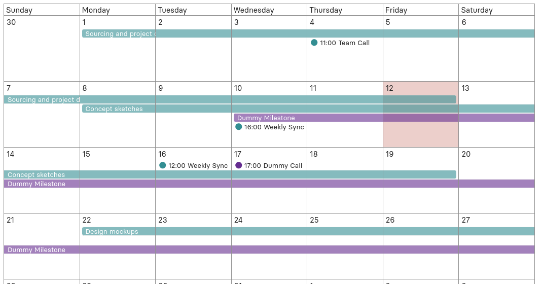
Events pick up category colors on the calendar view. This is the current look:
It’s difficult to locate regular events against the all-day events. I think toning down the all-day events would improve visual hierarchy on the calendar view:
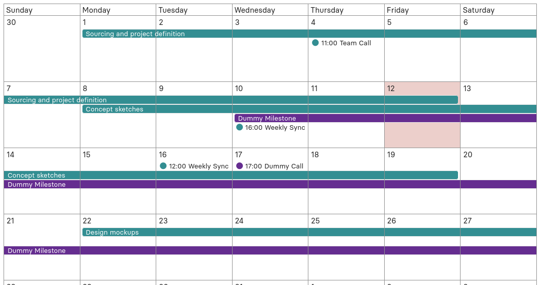
Events pick up category colors on the calendar view. This is the current look:
It’s difficult to locate regular events against the all-day events. I think toning down the all-day events would improve visual hierarchy on the calendar view:
I agree that regular events could do with being a bit more prominent.
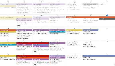
If we use transparency (of the all / multi-day events) to achieve that, we somewhat impair the ability to make old events transparent. I note that Google calendar does this, and it is really effective:
I think that we should follow Google Calendar’s lead on this one. I guess we could combine the two approaches with some transparency for all day events and increase that for old events - this would get us the best of both worlds.
Alternatively we could use a less saturated version of the category color (as we do with --primary-low vs --primary–very-low) rather than transparency per se, but that would likely be much trickier to code!
What do others think?