The UI for the feeds on the Calendar pages looks great now:
However, the user experience on /my/preferences/webcal-keys is too difficult for most users.
Minor suggestion
I note that the documentation link opens in the same tab - it would be nice to have that open in target=“_blank”
Currently
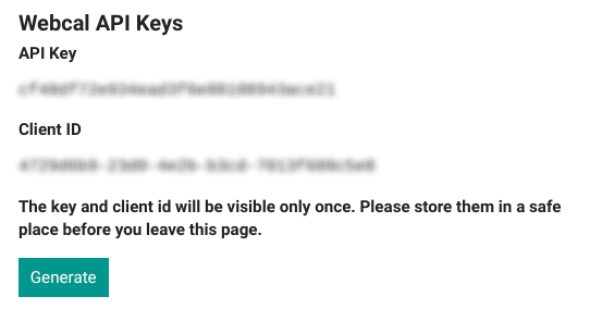
This is what the user sees:
With this explainer on a separate documentation page:
The user has to put this all together, and then paste it into the correct place in their calendar app.
Suggestion
That the /my/preferences/webcal-keys page does this as well:
-
Has a category dropdown selector for picking the calendar desired
- the first/top option is the whole site
-
Presents the keys assembled into an actual link (easily copied) based upon the category selected
-
Has instructions of where to put this for the common calendar apps (Google, Outlook, etc) on the same page
- or a link to that documentation that opens in another tab