Each step can have multiple fields. Each field has its own settings.
Add, remove and re-arrange
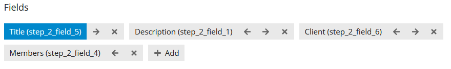
You can add, remove and re-arrange fields using the controls below “Fields”. The text in (brackets) is the field id (e.g. “field_1”). You may need to know that for some Conditional fields.
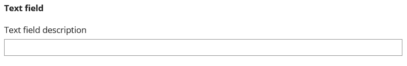
Label
This text will appear above the field input.
Description
This text will appear below the Label, and above the field input.
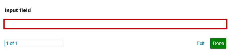
Required
The user will not be able to progress to the next step if the field is required and the user has not filled it. If the user does not fill it and clicks “Next” or “Done”, their screen will scroll to the field, and it will be highlighted in red.
Image
Image that will appear below the label and above the description. As with all wizard elements, you can style this image using a Wizard Theme.
Type
All fields must have a Type. You can find details on the standard field types below. The text in (brackets) is relevant to the Type-specific settings (see below).
Text (text input)
A simple text input.
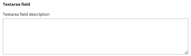
Textarea (text input)
A simple expandable textarea.
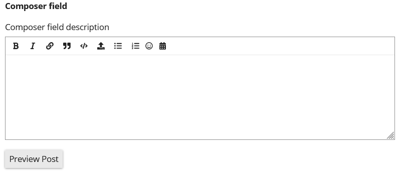
Composer (text input)
A composer with markdown support.
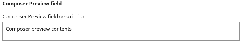
Composer Preview
A composer preview field. This allows you to expose a field or give the user a preview of how a constructed post or message will look. Works the same as the post Builder in the Create Topic and Send Message actions.
Text Only
A text label (no input)

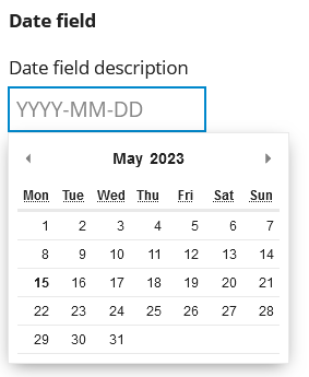
Date
A date field. The saved value will be formatted according to the moment.js format you set in the format input. Check out Handling Dates and Times for more details.
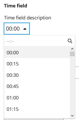
Time
A time field. The saved value will be formatted according to the moment.js format you set in the format input. Check out Handling Dates and Times for more details.
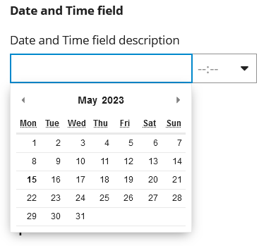
Date & Time
A combined date and time field. The saved value will be formatted according to the moment.js format you set in the format input. Check out Handling Dates and Times for more details.
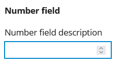
Number
A number input (numbers only).
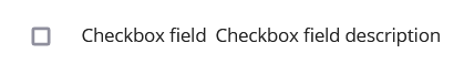
Checkbox
A checkbox. Label appears inline on right.
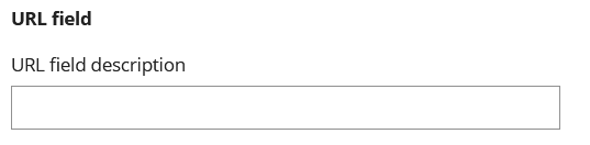
Url
A text input that ensures the entry is a URL
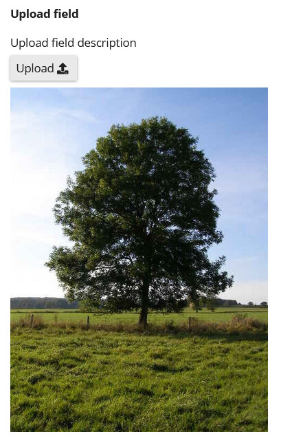
Upload (File)
A file upload. If the type is an image, a preview will be shown. You can change the style of the preview using a Wizard Theme.
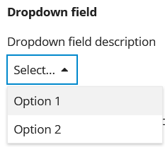
Dropdown (Selection)
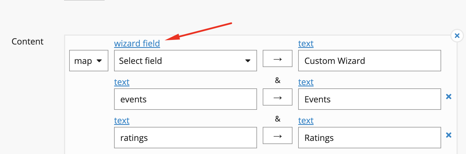
A custom dropdown list. You can set the entries in the list, and its prefill value, using the Content and Prefill settings.
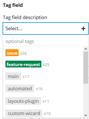
Tag (Selection)
A tag selector. All tags on your forum that the user has access to are available, unless the Content setting is used. See other Selection-specific settings below.
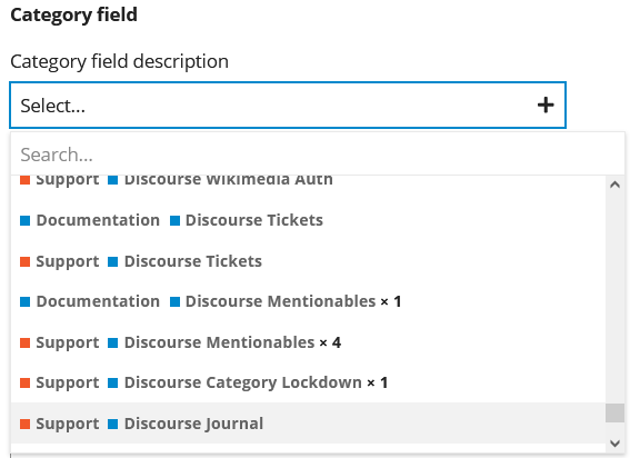
Category (Selection)
A category selector. All categories on your forum that the user has access to are available, unless the Content setting is used. See other Selection-specific settings below.
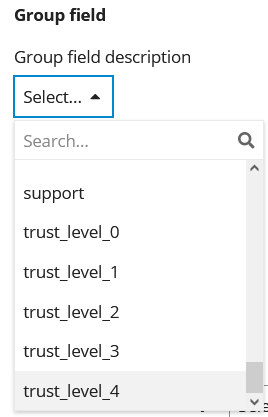
Group (Selection)
A Group selector. All groups on your forum that the user can see are available, unless the Content setting is used. See other Selection-specific settings below.
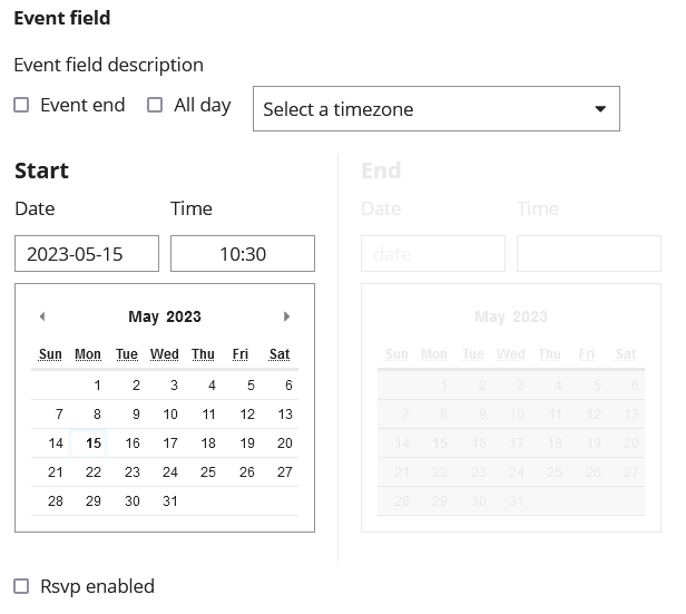
Event (Events Plugin Required)
An event input. The Events Plugin is required for this type.
Location (Locations Plugin Required)
A geo-location input. The Locations Plugin is required for this type.
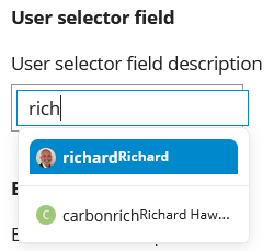
User Selector
A User selector. All active users on your forum are available.
Type-specific
File Types (File only)
You can restrict the allowed file types by entering comma-separated list of extensions. If the user attempts to upload a non-permitted type, an error message will appear.
Limit (Selection only)
Maximum number of selections. If the user attempts to exceed the limit, an error message will appear.
Min Length (text input only)
Minimum character length. If the user does not fill the field to the required length, they will see an error message if they attempt to progress.
Prefill (Selection only)
A conditional field that prefills the value of a selection field.
Content (Selection only)
A conditional field that sets the content of a selection field